Project Overview
Ovrae launched into a feminine care category where every competitor — from Rael and Cora to local entrants — had converged on the same claims: organic cotton, sustainable packaging, give-back models. No brand was speaking to African women in their own cultural and physical context, and none had built a full-stack organic system that felt like it belonged on a skincare shelf. The brief was rooted in lived experience — PCOS, endometriosis, pain dismissed as normal — and the insight was sharp: the product wasn't the gap. Dignity was.

The Challenge
Feminine care is one of the most culturally loaded product categories in the world, and in African markets it carries additional weight: the products themselves are often hidden — tucked inside food wrappers, avoided in public. Competitive analysis showed a converging market with no meaningful visual differentiation and no brand speaking directly to the physical and cultural experience of African women. The brief wasn't just packaging. It was to build a brand that treated the cycle as something to understand rather than hide — and to do it without borrowing the clinical language that had defined the category for decades.
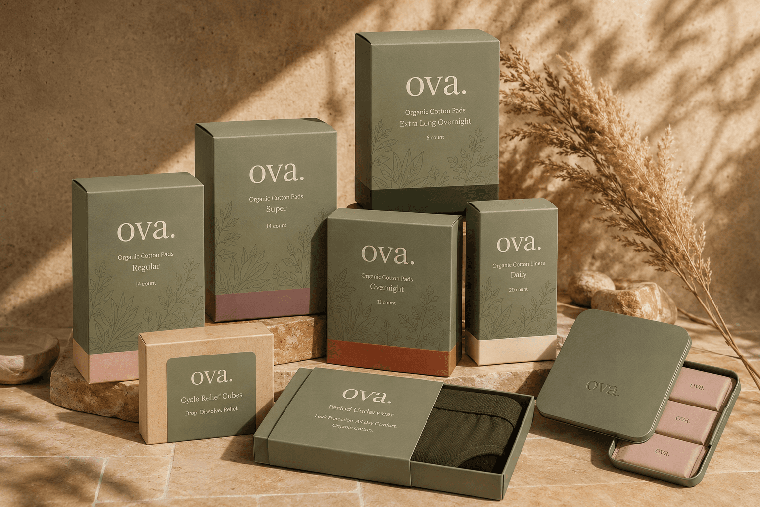
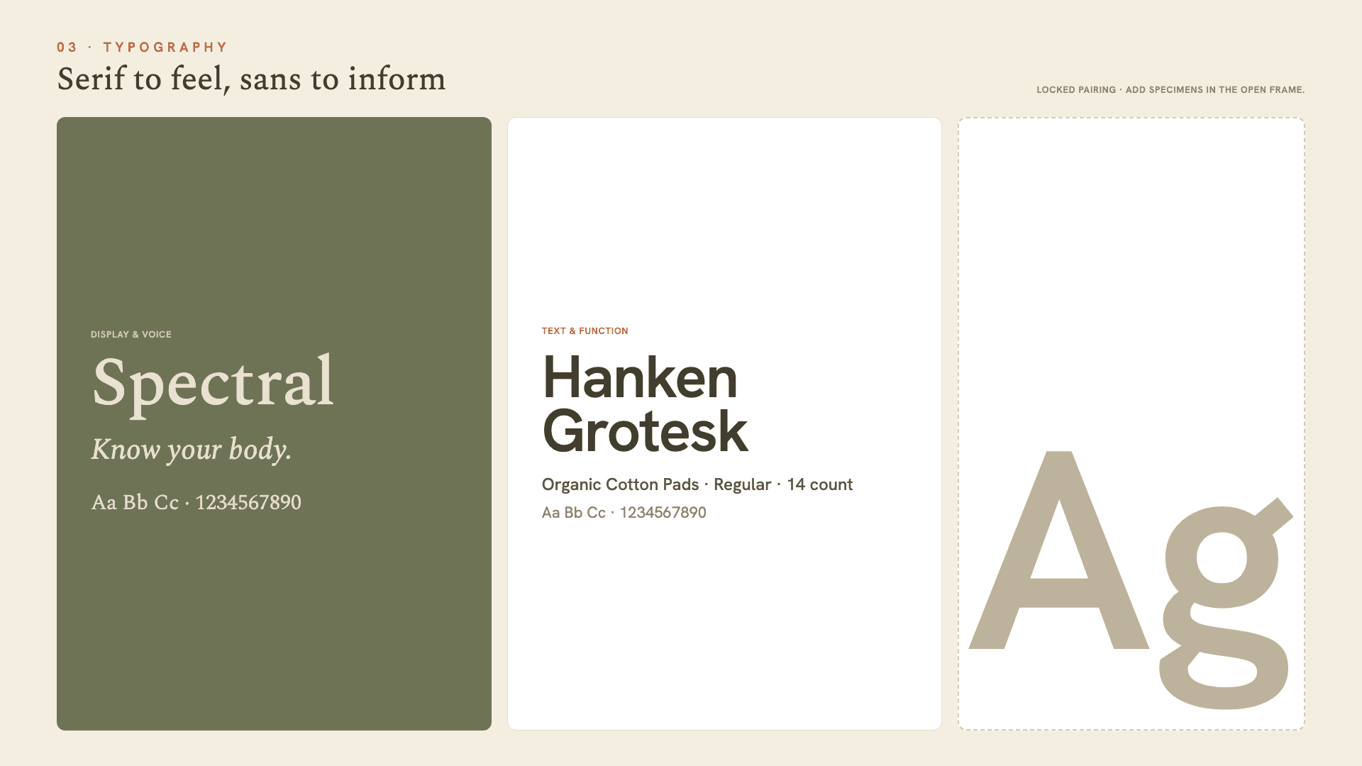
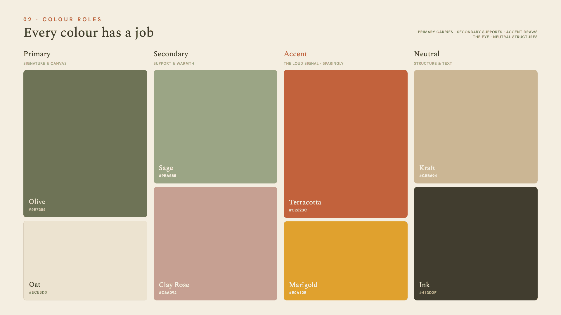
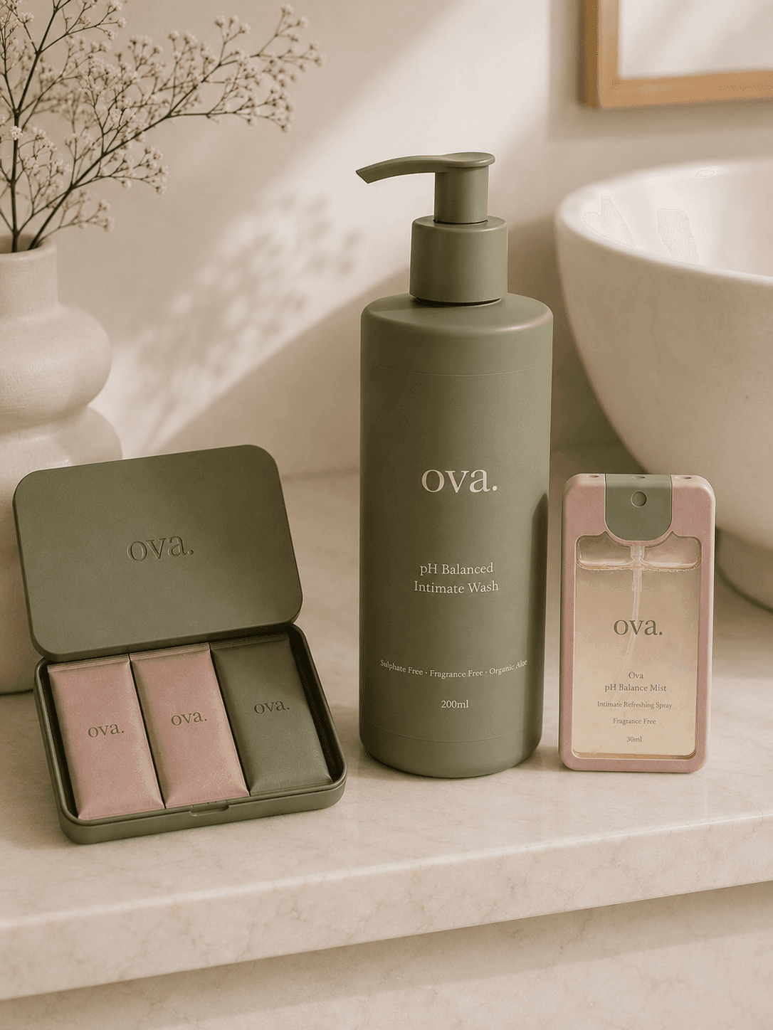
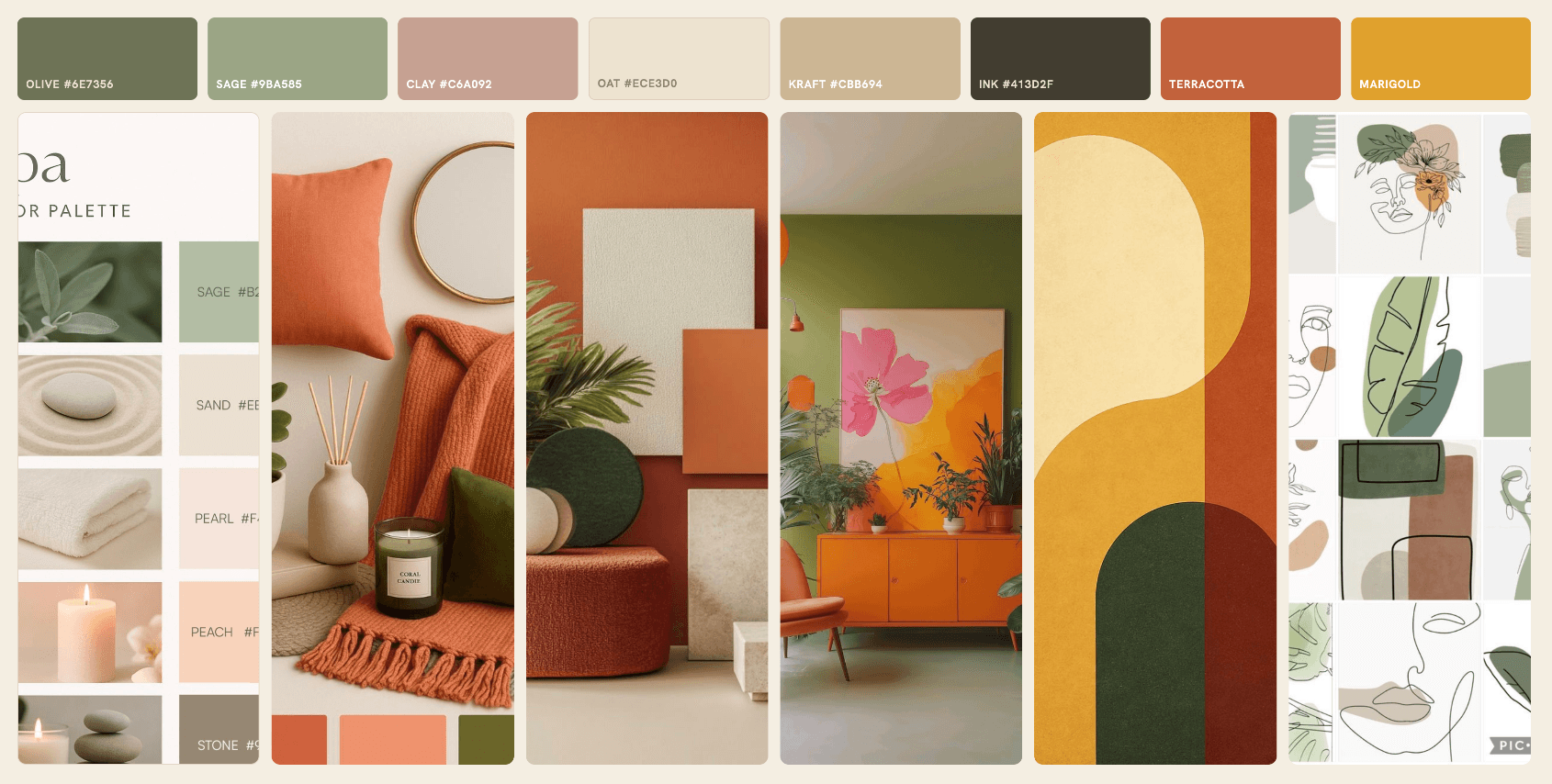
- Brand identity: lowercase wordmark, typographic system, and colour architecture (soft sage, dusty blush, kraft)
- Brand North Star and inner-world strategy framework
- Full product packaging system: carry tin, individually wrapped pad, subscription box, and wipe
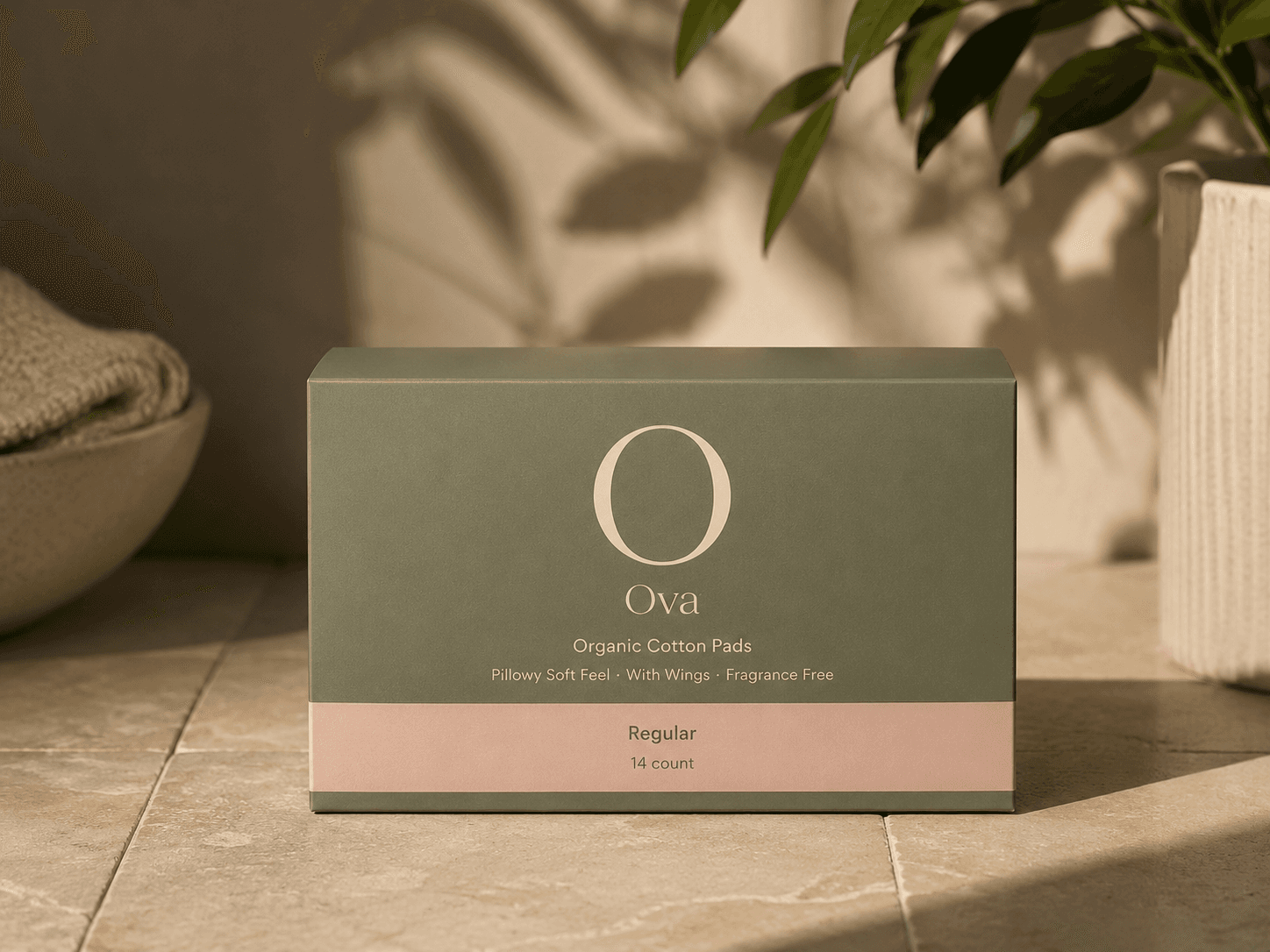
- Matte aluminium and kraft paper material direction across all touchpoints
- Competitive positioning framework and cultural insight report
- Digital brand presence and tone-of-voice guidelines
- WhatsApp community brand expression system

The Approach
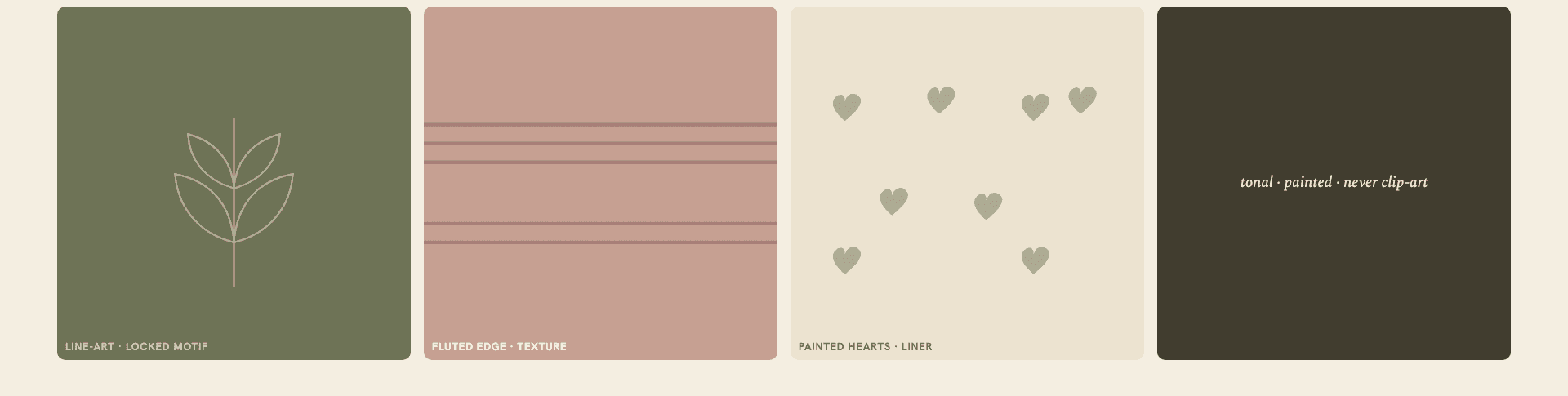
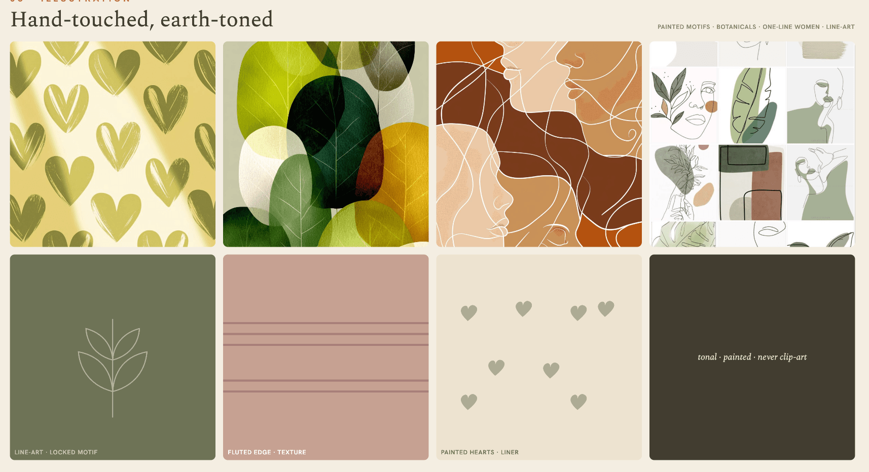
We began with founder workshops and a competitive audit mapping every brand in the space — Rael, Cora, August, and local entrants — against visual language, ingredient transparency, cultural specificity, and tone of voice. The white space was clear: quiet, dignified, full-stack organic, culturally honest. We defined Ovrae's inner world as "your body, decoded" and built the North Star — honest ingredients, carried without embarrassment — as the filter for every decision that followed. The visual system moved deliberately away from clinical blue-and-white pharmacy codes and toward the language of quiet luxury skincare. Soft sage, dusty blush, and kraft tones replace medical colour-coding. Matte aluminium and kraft paper replace plastic shine. The lowercase "ovrae." mark became the signature of that shift — a brand that treats its name the way it treats its products: without unnecessary force.
Execution
The final system covers 4 core touchpoints — period pad carry bag, panty liner wallet, wet wipe pouch, and spare pad sleeve. The 100% organic material stack runs from formula to packaging: no synthetics, no greenwashing. A carry-first design means the primary packaging is the bag itself — a minimal, reusable tote with a tonal label, not a box you throw away. Shipped as a complete feminine hygiene carry system designed to be the first in its category to look as good as it works.
The Outcome
The result is the first brand in its category to be designed carry-first, not product-first. The visual system is ready to scale — from DTC to retail, from Lagos to London — because it was built on principles, not aesthetics. Ovrae now has the assets, tone, and system to move from a founding product range into a broader wellness brand as the category grows. The 100% organic material stack, the quiet luxury positioning, and the carry-first innovation make it genuinely first in category — not as a claim, but as a design decision that shows in every touchpoint.
“We needed a brand that tells the truth about what touches her body — something she's proud to carry in the open, not hide inside a wrapper.”
— Founder, Ovrae